Everyone wants their website to load as fast as possible, especially for people on mobile devices. When time is scarce and very precious, waiting for pages to load can be extremely frustrating.
Responsive web design is all very well, but often whilst pages are designed to look pretty on a device with a smaller screen, they might still need to load a lot of unnecessary resources, such as oversized images or bloated CSS/JS in order to run. Clearly this takes more bandwidth and slows things down.
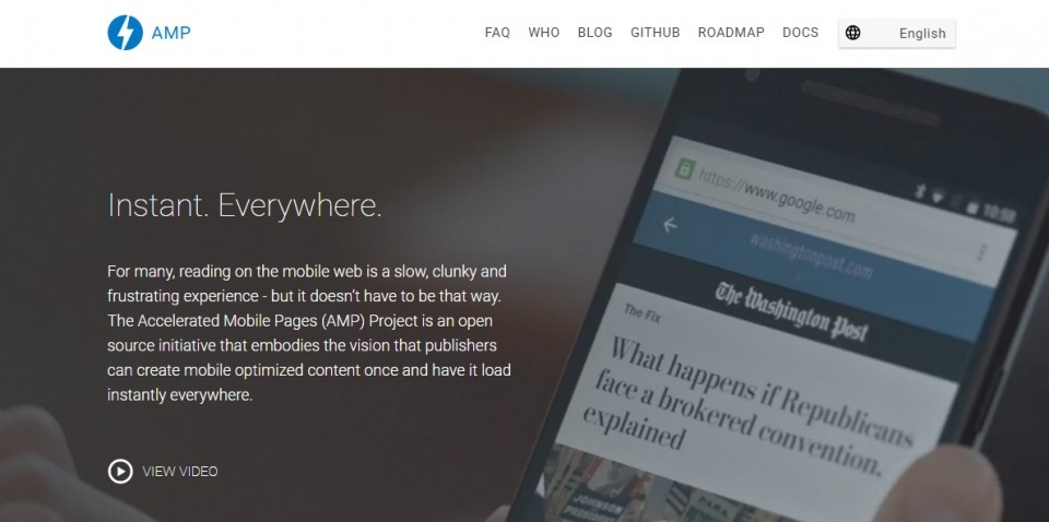
This is why the Accelerated Mobile Pages (AMP) project was started.
If you’re looking for a technical introduction then here’s a link to a video with an extremely technical looking bloke to explain all about it far better than I can.
Our first dalliance with AMP
I love the concept behind AMP, but there’s actually quite a bit to get up to speed with when implementing it in production. So I thought where better to experiment than this very blog. So I’ve created an AMP version of each news article.
Example standard blog article:
https://www.18aproductions.co.uk/news/view/retina-images-automatically-serve-high-res-images-to-those-wholl-appreciate-them
The same page loaded via the AMP template:
https://www.18aproductions.co.uk/news/view/amp/retina-images-automatically-serve-high-res-images-to-those-wholl-appreciate-them
There’s a handy little ‘getting started‘ article on the AMP website which I’d recommend.
I won’t get into the boring technicalities of how I created an AMP specific CodeIgniter template, and how I updated the news controllers and routes file to make it serve content to the AMP specific view I created when /amp/ is in the URL, as that’s far too specific to our particular website setup to be useful to anyone, but I will just give a quick run-down of a couple of problems I came up against while getting this working.
Problem 1: <amp-img>
Our blog articles sometimes contain <img tags. We have a WYSIWYG editor which allows us to upload images. Therefore just printing out the article content renders these image tags which need to be converted into the supported and optimised <amp-img> tags.
Solution: A quick regex in the controller did the trick, replacing <img with <amp-img layout=responsive
Problem 2: Template & Mobile Side Menu
I appreciate the need to keep things light in file size, but I also didn’t want to create a completely styleless, ugly page with no onwards navigation. So there clearly is a balance to be had. My compromise was to massively simplify the design to just include a basic header (including logo and menu), and footer (including copyright and site information). Getting the menu to work on mobile was my next challenge as you can’t use your own JS code. Luckily a little snooping around on the main AMP website and viewing of their source code led me to the AMP sidebar component, which after a little styling does the job nicely.
Aside from that, it was really just a case of reading the getting started guide, grabbing a copy of the boiler template and getting AMPing! 🙂


