;transform: ;msFilter:;'%3E%3Cpath d='m20.487 17.14-4.065-3.696a1.001 1.001 0 0 0-1.391.043l-2.393 2.461c-.576-.11-1.734-.471-2.926-1.66-1.192-1.193-1.553-2.354-1.66-2.926l2.459-2.394a1 1 0 0 0 .043-1.391L6.859 3.513a1 1 0 0 0-1.391-.087l-2.17 1.861a1 1 0 0 0-.29.649c-.015.25-.301 6.172 4.291 10.766C11.305 20.707 16.323 21 17.705 21c.202 0 .326-.006.359-.008a.992.992 0 0 0 .648-.291l1.86-2.171a.997.997 0 0 0-.085-1.39z'%3E%3C/path%3E%3C/svg%3E)

SUMMARY
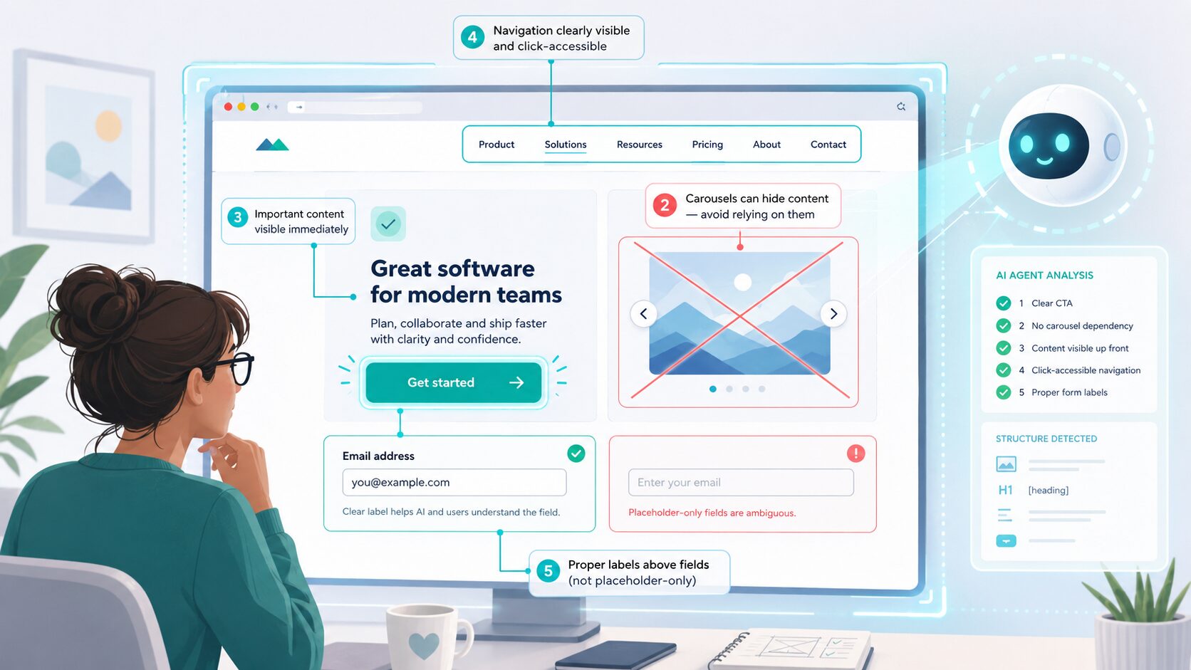
Make sure your website design would work as a screenshot.
- Ensure buttons are clearly buttons
- Don’t use slideshows for anything important
- Don’t slide or fade text into view
- Don’t make menus only available on hover
- Don’t only use placeholder labels on forms
We were reviewing a design last week – nice site, nice client, nothing wrong with it in the traditional sense – and I found myself doing something I didn’t used to do at that stage. I was looking at it and mentally screenshotting it, the way an AI agent would, and asking “could something navigate this without a human brain attached?”
That’s a new lens! Not replacing the old design review, just sitting alongside it. And it’s changed a handful of specific things about how we brief and check designs now. Here are five of them.
1. Buttons have to be unmistakably buttons
This isn’t a new principle – good design has always made buttons look like buttons, that’s basic usability. But we’re now double-checking it far more deliberately, because agentic AI (systems that browse and act on a site on a user’s behalf, not just read it) often works partly from screenshots. It’s assessing what it’s looking at visually, alongside the code. So a small, elegant ghost button that a human would happily hover over and click can genuinely get missed or misjudged by an agent, purely because of size, contrast, or placement – even when the underlying code is perfectly correct.
So we’re checking: is it big enough, is the contrast strong enough, is it clearly positioned where a “next action” would be expected? A design choice that used to be purely aesthetic (subtle, minimal, tasteful) now has a functional consequence we have to weigh up consciously.
2. No slideshows for anything that matters
Slideshows and carousels have been on the “probably not great for humans either” list for years – people don’t wait around for slide three, we’ve known that for a long time. But agentic AI adds a much harder reason to drop them: an agent that screenshots a page gets ONE frame. If the thing it needs is on slide two of four, and nothing’s told it to wait and click through, it simply doesn’t see it. It’s not that the agent is impatient like a human visitor – it’s that it may never know there’s anything else there at all.
So anything commercially important – key services, key claims, key calls to action – needs to be visible in the page as it loads, not queued up behind a rotation.
Liking this explainer?
Get Lisa’s weekly email, with timely and helpful quick wins for your website.
Subscribe3. No slide-to-reveal or fade-in text
Same underlying problem as the slideshow, different flavour. Text that slides in, fades up, or reveals itself on scroll is lovely for a human scrolling at their own pace – but if an agent captures the page before the animation’s finished (or before the scroll trigger’s fired), that content might as well not exist. We’re moving toward content just being THERE, in the DOM (the actual page structure, not just what’s rendered on screen at a given moment) and visibly present, rather than something that arrives as a little performance.
4. No hover-only menus or tooltips
Dropdown menus and tooltips that only appear on hover assume a mouse, moving over a specific pixel, pausing there. Agents apparently don’t really “hover” the way a human does – they’re working through code and screenshots, not moving a cursor around exploring. So if navigation or important detail is locked behind a hover state with no other way to reach it, an agent can miss whole sections of a site. We’re pushing toward menus and detail that are either visible by default or reachable through a proper click/tap, so there’s always a route in that doesn’t depend on a hover gesture nobody’s actually performing.
5. No placeholder-only form labels
This isn’t quite a design one… but it is in as much as if this is present in the design, I’ll flag to the developer not to solely rely on the design aspect. A lot of forms use placeholder text INSIDE the field as the only label – “Email address” sitting greyed out in the box, which disappears the second you start typing. Humans generally cope with that because we remember what we clicked into. Agents filling in a form on someone’s behalf need a proper, persistent label associated with the field in the code, because once there’s anything typed in the box, the placeholder’s gone, and if that was the only clue about what the field was for, the agent’s guessing. This one’s also just better accessibility practice anyway, so it’s not really a new rule, more a reason we’re enforcing it more.
The common thread
Every one of these is really the same principle wearing a different hat: if it only works because a human is patiently sitting there, moving a mouse, waiting for an animation, or remembering what they clicked – it won’t work for an agent. And increasingly, some proportion of your visitors ARE an agent, acting on behalf of a real person with real intent to book, buy, or enquire. A missed agentic conversion is still a missed conversion.
None of these five things are difficult to fix on their own. But they’re all things that now need a conscious yes/no decision at design stage, where before a lot of them were just… aesthetic preference. That’s the actual shift – not that the work got harder, but that there’s more of it to consciously think through before sign-off.
If you’re reading this before the 16th July 2026 and want to know more about getting your website ready for Agentic AI, grab a free seat at my next webinar – “Is your website usable by AI?” If you’ve missed it, grab the replay of that or any of my SEO and AI talks here.

