;transform: ;msFilter:;'%3E%3Cpath d='m20.487 17.14-4.065-3.696a1.001 1.001 0 0 0-1.391.043l-2.393 2.461c-.576-.11-1.734-.471-2.926-1.66-1.192-1.193-1.553-2.354-1.66-2.926l2.459-2.394a1 1 0 0 0 .043-1.391L6.859 3.513a1 1 0 0 0-1.391-.087l-2.17 1.861a1 1 0 0 0-.29.649c-.015.25-.301 6.172 4.291 10.766C11.305 20.707 16.323 21 17.705 21c.202 0 .326-.006.359-.008a.992.992 0 0 0 .648-.291l1.86-2.171a.997.997 0 0 0-.085-1.39z'%3E%3C/path%3E%3C/svg%3E)
Web Design & Development
We are passionate about crafting websites and web systems, tailored to suit a diverse array of needs and scales. Whether it’s a brochure site, E-commerce platform, membership site, CRM system, or a fully bespoke custom development, we’re excited about every challenge and the change we can bring to organisations.
Our love for the web is at the heart of our work. It’s this love affair that drives us to stay up-to-date with the latest developments and push the boundaries with technologies when we believe it’s right for your project.
I found 18a had a rare combination of the 3 essentials I feel make a website project work – creative, technical and then project management and a rare passion to work hard to get it right comes through.
Solid Technical Foundations
Deciding to invest in a new website, online tool, or app is a significant and incredibly difficult decision. Your site’s success and longevity depends largely on the unseen elements – the foundations it’s built on.
We’ve built countless websites for clients over the years, using WordPress, Laravel and CodeIgniter and more besides, so can advise you on the best framework or platform for your needs.
Our experience ensures you don’t make the wrong choice of platform or software which can lead to major technical debt for your organisation.
Bob was right – it’s good to talk
As your technical partners, we don’t shy away from candid conversations. Our commitment is to provide honest and pragmatic feedback, guiding you towards the realisation of your business goals. We will ask the pertinent questions and probe your business objects until we’re confident what we’re suggesting is the right route to take.
Our clients tell us they love how we’re open and flexible – and crucially we don’t just do what we’re told. If you ask for something, and we think it could be done in a different way which would save you time and money or help you reach your goals faster, we’ll always let you know.
Inherited websites
We very often inherit websites. By this we mean a less technical agency has built a client a website, but then found they couldn’t support it long term once their requirements got more technical or their traffic levels increased. We can take over the care of your website and move you forward.
Whilst lots of agencies don’t like taking over someone else’s work and will encourage you to start over with a new site, we like to be more pragmatic, consider your requirements, and work with your existing site if that’s what’s best for your organisation. Sometimes that’s a case of helping it limp along for another few years before you’re ready for a rebuild, or sometimes it’s a case of taking what you’ve got and making it really work for you, moving it forward and improving on it step by step.
Case Study Jericho Writers WordPress website overhaul >>
Website Rebrand
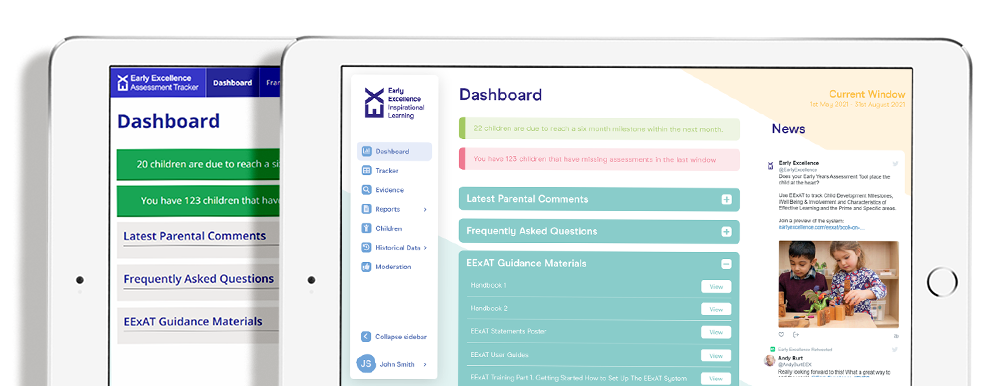
Very often an organisation comes to us on the verge of a rebrand – they don’t have the budget for a new website but their brand is moving forward and they need their old website to reflect this. We can work with you and your branding agency to create a design for your old website which reflects your new identity in a way that is cost effective to deliver, as we have done for leading single parents charity Gingerbread, and as we did for Exaat’s early years education tool (pictured left – with their original dashboard shown behind the redesign we did for them).
Our inhouse design team can take brand guidelines and produce a new set of website visuals, or we can work with your existing design team to guide them on how to design something that will be quick and cheap to turn around.
Search Engine Optimisation
All of the sites we build are structured with SEO in mind, from navigation to the technology used, to the design ensuring the site can load quickly. It’s also vital to remember that SEO is a competition – it doesn’t matter how good your website is if your competitors’ are better so we can carry out SEO competitor analysis and prepare you a strategy that will help shoot you up the SERPs (SEO slang for search results). We also teach SEO if you’d like to do it inhouse.
Inhouse designer developers
For smaller updates, we can make new site developments even more efficiently (read: more cheaply!) by skipping a separate design phase and making technical and UX changes to your website in keeping with your existing brand.
We can then change anything you don’t like, but this doesn’t normally need to be done – our clients love the end result and have skipped hours or days of work to get there.
Lisa has the uncanny knack of being able to distill the most complicated of website briefs in to the most simple steps whilst at the same time being the most personable and efficient project manager I have ever come across.
subscriptions
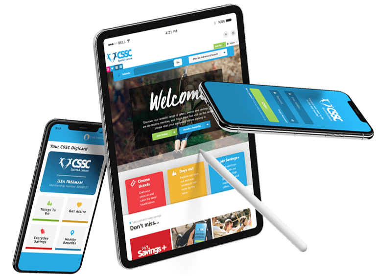
Membership sites
We’ve built and inherited a wide range of Membership sites, on platforms including WordPress, Laravel and CodeIgniter always ensuring the joining and renewal processes are swift and intuitive.
We regularly integrate with CRMs such as Salesforce, Microsoft Dynamics, Zoho CRM, Mailchimp and SAP Business One, or can help you manage your user data within your website.
Working with recurring payments is everyday work for us, whether that’s with Stripe, PayPal or Global Payments besides others, including automated BACs remittance.
Project plan
For visibility throughout the project we use various tools to help us manage projects efficiently, including Monday.com, Trello, Zoho and Github. However we’re always happy to use any project managements tools a client might already be using, such as Basecamp or Redmine to name a couple of others.
Communication is vital. Everyone you speak to knows what they’re talking about and will care passionately about not just getting the job done, but doing it right, and communicating that back to you clearly and concisely in a way you understand.
Tech stack
Our UK web developers primarily build using PHP and JavaScript and have expert knowledge of the following platforms.
- Laravel
- WordPress inc. Woo and Lifter
- CodeIgniter
- Magento
Alongside this, we love to spice up the projects we build by using technologies such as ReactJS and Alpine.js. These tools not only enhance but transform the user experience, ensuring that your project not only meets but exceeds expectations.
We can also craft your hosting solution to prioritise speed, reliability and security, employing optimisation techniques to guarantee an exceptional user experience while maintaining robust protection against potential threats.
Hello, agencies 👋
Let us be your technical partners, delivering projects under your banner, for your clients.
Due to our in house skill set, agencies often come to us when they need specialist help. If you’re looking for a friendly bunch of people to help you with any digital projects that are straying outside of your comfort zone or that you just don’t have resource for right now, give us a shout.
We’re used to NDAs and whitelabels – although we do find direct client contact is the most effective, whilst always keeping you in the loop. We really value building long relationships with our agency clients.
We have worked with a large number of coders and none come close to the team at 18a. I highly recommend you get in touch with 18a to see how they can help you successfully build out your online projects.